
MWEdisplay Academy · Content & Placement
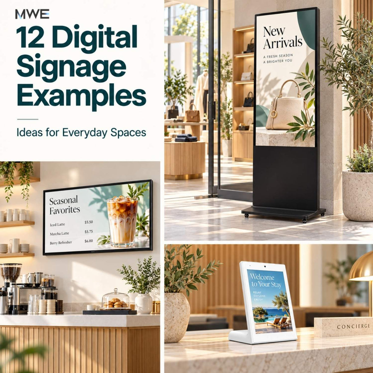
The most useful digital signage examples start with a question from the person looking at the screen: What can I order? Which product fits? Where is my meeting? A good display answers that question at the right place.
A screen can be working perfectly and still be unhelpful. A hotel guest may see a promotional video when they need breakfast hours. A shopper may see a brand slogan when they need to compare two products. Start with that missing information, then choose the layout and display.
This guide gives you 12 practical examples across retail, restaurants, hotels, offices, exhibitions, and wayfinding. Each includes sample screen copy, placement advice, an update routine, and a mistake to avoid.
Quick answer: Use menus and directories to answer questions, offers to introduce one relevant choice, and demonstrations to explain how something works. Keep essential information visible. Add motion or touch only when it helps the viewer complete the task.
About the examples: All sample messages, prices, room names, and schedules below are illustrative. They are not customer case studies, actual promotions, or claims of measured business results. Adapt and verify them before use.
Choose an example by the job your screen needs to do
| Viewer's question | Examples to start with | Content priority |
|---|---|---|
| What is available here? | 1. Entrance offer · 4. Menu · 5. Daily special | Current offer, choice, or availability |
| Which option should I choose? | 2. Product comparison · 3. Counter addition | A meaningful difference or relevant next choice |
| What do I need to know? | 6. Hotel services · 8. Visitor welcome · 9. Staff notice | Short instructions and essential details |
| What happens next? | 7. Event board · 10. Product demonstration · 11. Booth session | Time, sequence, and next action |
| Where should I go? | 12. Building directory | Destination and verified direction |
For a single-screen project, choose one primary job first. Combining a directory, a sales promotion, a weather feed, and a video on the same display often leaves too little room for the information people actually need.
12 digital signage examples you can adapt
1. Retail entrance: introduce one current offer
The job: Help an arriving shopper decide whether to explore the store.
WEEKEND LAYERING EDIT
Light jackets for cooler mornings
Explore the collection →
Build the content: Use one strong product image, one headline, and a direction that matches the actual store layout. If you advertise a discount, include its dates and important conditions rather than hiding them in unreadable text.
Place it: Just inside the entrance, facing the arriving shopper. A floor-standing display can work where there is clear space around the base; keep the entrance and walking route unobstructed.
Update it: Review at opening and whenever the campaign or featured stock changes.
Avoid: Do not assume a standard indoor screen will remain readable through a sunlit window. Assess glare, brightness, and heat at the intended position.
2. Product comparison: explain the difference at the shelf
The job: Answer a purchase question without making the customer search through a long specification sheet.
WHICH BAG FITS YOUR DAY?
DAYPACK · Everyday essentials
WEEKENDER · Extra space for short trips
Compare compartments below
Build the content: Show two products side by side and compare the same three attributes: capacity, compartments, and intended use. Replace these illustrative labels with verified facts about your own products.
Place it: Beside the relevant shelf, using a wall-mounted screen or close-up tabletop display. Keep the physical products within sight.
Update it: Change the comparison when a model, price, or specification changes.
Avoid: Avoid a ten-product spreadsheet on a small screen. If visitors need filters or more detail, use a tested interactive interface rather than squeezing in more columns.
3. Checkout counter: suggest one useful addition
The job: Show an optional accessory while the customer is already near the purchase point.
TAKING YOUR COFFEE TO GO?
Reusable cups available here
Ask us about sizes
Build the content: Use a clear image of the available cup and a short invitation. Keep the message separate from payment instructions so customers do not confuse the display with a payment terminal.
Place it: A compact tabletop screen beside the accessory, without blocking the cashier, payment device, or sightline across the counter.
Update it: Check availability each day and remove the message when the item is unavailable.
Avoid: Do not stack several unrelated offers or show a QR code without explaining what it opens.
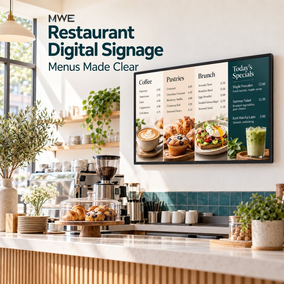
4. Restaurant menu: keep the ordering information visible
The job: Let guests compare choices and prices before they reach the cashier.
LUNCH MENU
Roasted vegetable sandwich · $9
Chicken salad · $12
Soup of the day · $6
Ask our team about ingredients
Build the content: Group items into a few clear categories, align prices, and keep essential choices visible. These prices and dishes are fictional examples, not MWE offers. Detailed ingredient information needs a reliable, maintained source.
Place it: A wall-mounted menu within the ordering queue's sightline. Check the smallest item name and price from the back of the queue.
Update it: Verify before each service period and immediately after a price or availability change.
Avoid: Do not replace the whole menu with an advertisement while guests are trying to order.
5. Café special: give a limited-time item its own space
The job: Introduce one item without making the main menu harder to read.
TODAY'S SPECIAL
Tomato soup + sourdough
Available from 11:00 AM
Ask at the counter
Build the content: Make the food photograph the focal point, followed by the item name and availability. Add the actual price before publishing. A brief food-preparation clip can work if the offer remains understandable without sound.
Place it: A separate counter display or a dedicated, readable zone beside the menu. Only divide a screen if both sections remain legible.
Update it: Check before lunch and remove the offer when sold out.
Avoid: Do not promise an automated stock update unless your software is connected to a verified inventory source.
6. Hotel reception: answer routine arrival questions
The job: Make basic service information easy to check during or after arrival.
GOOD TO KNOW
Breakfast · 7:00–10:00 AM
Garden Room · Ground floor
Check-out · 11:00 AM
Build the content: Use short labels and keep the most requested details together. A second language can be a separate page selected by the guest, or a carefully designed parallel layout if space permits.
Place it: A tabletop display on the guest-facing side of reception, readable without leaning across the desk.
Update it: Review whenever service hours, locations, or hotel policies change.
Avoid: Keep guest names, room numbers, booking details, and staff-only information off a general public screen. Provide staff assistance for visitors who cannot use the display.
7. Hotel event board: show what is happening next
The job: Direct attendees to the correct room without requiring them to ask at reception.
TODAY'S EVENTS
09:30 · Partner briefing · Cedar Room
14:00 · Product workshop · Maple Room
Meeting rooms →
Build the content: List events in time order with the date, room, and direction. Limit the board to relevant upcoming sessions rather than displaying an entire week's calendar. The room names and schedule here are illustrative.
Place it: A wall-mounted or floor-standing display before the route divides toward meeting rooms.
Update it: Confirm each morning and immediately after a room or time change.
Avoid: Do not display private event titles without approval or show a cached schedule as if it were live. Calendar feeds require suitable software and correct access settings.
8. Office reception: explain the arrival process
The job: Help a visitor take the first step without revealing the appointment list.
WELCOME
Please check in with reception
Meeting rooms are on Level 2
Need assistance? Ask our team
Build the content: Show a welcoming headline followed by a single arrival instruction. If a kiosk supports digital check-in, explain the action clearly and make sure staff can help when the service is unavailable.
Place it: Facing the entrance, where it is visible before visitors choose a corridor. Use a wall display or a small screen at the reception desk.
Update it: Review when reception hours, visitor procedures, or routes change.
Avoid: A touchscreen does not itself provide visitor-management software. Do not show check-in controls unless the complete workflow has been configured and tested.
9. Staff area: make one operational notice hard to miss
The job: Give employees information relevant to the current shift.
THIS WEEK
Team briefing · Thursday, 2:00 PM
Training room · Level 1
Questions? Speak with your supervisor
Build the content: Give priority to one notice with a clear date and next action. Additional items can appear beneath it only if they remain readable. Keep dashboards simple and label when their data was updated.
Place it: A staff-only break area or workroom where people can pause, not a visitor-facing lobby.
Update it: Review at the start of the week and when a deadline or instruction changes.
Avoid: Remove expired notices and protect confidential information. General signage should not be treated as a substitute for required safety communications or a verified emergency system.
10. Trade show demonstration: explain one product action
The job: Help a passing attendee understand what a product does before a conversation begins.
SEE THE WORKFLOW
Choose an item → Compare options → View details
Ask for a live demonstration
Build the content: Show the process through a short captioned demonstration. Make each segment understandable if someone joins halfway through. Use real footage of the demonstrated feature, not a simulated feature presented as available.
Place it: A display beside the physical product demonstration. Match text detail and viewing distance to the display's usable resolution.
Update it: Test before the event and whenever the demonstration changes.
Avoid: Avoid a long brand-introduction video before the useful part. Small interface text may need a close-up LCD screen rather than a distant LED poster.
11. Exhibition booth: make the next session easy to find
The job: Give visitors a reason and a clear time to return to the booth.
NEXT LIVE DEMO
2:30 PM · Here at our booth
Explore the product range
Ask our team for details
Build the content: Keep the next session's time prominent and include the booth identifier when useful. A brochure QR code can be secondary; provide a staff-assisted alternative and test the destination on a phone.
Place it: At the booth edge on a suitable floor-standing or portable display, inside the exhibitor's permitted area.
Update it: Update after every session and when the schedule changes.
Avoid: Do not leave a completed session labelled 'next.' Confirm power, stability, and transport requirements rather than assuming a portable unit is battery powered.
12. Building directory: guide people at the decision point
The job: Help visitors select the right direction before they walk past the turn.
YOU ARE ON LEVEL 1
Reception ←
Meeting rooms →
Elevators →
Build the content: Use destination names that match the physical signs. Place arrows next to the relevant labels and verify every direction from the viewer's position. Add a simple map only if it makes the route easier to understand.
Place it: Before the corridor junction. A wall-mounted directory can remain visible; a touchscreen is useful if people need to search many destinations.
Update it: Review after room moves, access changes, or temporary closures.
Avoid: Do not mirror a layout without rechecking its arrows. General digital directions must not replace required physical exit or safety signs.
For more detail on these environments, see our retail digital signage guide, restaurant menu and placement guide, and hotel digital signage guide.
Static vs. animated content: choose for the task
Static content is not a lesser version of video. It lets viewers look back and forth between information without waiting for a slide to return. Motion is useful when the movement itself explains something, such as opening a compartment or completing a product step.
| Content | Useful starting format | What should stay visible |
|---|---|---|
| Menus, prices, and directions | Static layout | The information needed to make the decision |
| A product in use | Short, captioned video | Product identity and the next action |
| A seasonal promotion | Still image or restrained animation | Offer, validity, and important conditions |
| A daily event schedule | Readable list, updated when necessary | Date, times, and room names |
Do not pick a universal slide duration and assume every message fits it. Ask someone unfamiliar with the content to read it from the expected viewing position. If they miss a detail, simplify the layout or keep it on screen longer. Essential directions and menu choices should not depend on catching one frame in a long loop.
Passive vs. interactive signage: when is touch useful?
A passive screen presents information without requiring a response. A touch interface makes sense when visitors need to choose a language, filter a catalog, search a destination, or compare several options. A simple notice rarely needs interaction.
Before choosing touch, write down the first action, the result it opens, and the route back to the home screen. Test whether controls are reachable and whether the interface can recover after an abandoned session. Where an interaction handles personal information, plan privacy and session clearing with the software provider.
Touch hardware does not automatically include ordering, payment, booking, or visitor-management software. Verify the application, operating-system compatibility, network requirements, and support responsibilities. Our interactive digital signage guide explains this distinction in more detail.
Tabletop vs. wall-mounted vs. floor-standing displays
Choose the format around viewing distance and the available space, not simply the diagonal size. A small screen can be useful beside a product but ineffective as a directory across a lobby.
| Format | Typical fit | Check before choosing |
|---|---|---|
| Tabletop | Close-up offers, reception information, product details | Counter footprint, stability, cable routing, and usable text size |
| Wall-mounted | Menus, notices, directories, product comparisons | Viewing angle, mounting surface, access for updates, and reflections |
| Floor-standing | Entrance messages, event boards, exhibition information | Clear walking space, base stability, power access, and sightlines |
The MWE Table Touch Screen Digital Display is offered in 8, 10.1, and 14-inch sizes for close-up counter and reception applications. Use its compact format for a short message or a deliberately designed interface rather than a reduced-size copy of a wall menu.
The MWE Wall-Mount Touchscreen Digital Signage comes in 21.5, 32, and 43-inch sizes. Its Android 14 platform and touch capability can support compatible content applications; USB playback, HDMI input, and optional CMS integration offer different delivery paths. Check the selected size's mounting specifications and test the intended content before deployment.
The MWE Floor Standing Digital Signage range spans 32 to 65 inches, with touch and non-touch options. Choose a variant for the actual placement and content; do not assume every size has identical specifications. For event displays where LED is being considered, use the LED pixel pitch and viewing-distance guide to assess whether fine text will be readable.
These are potential hardware matches for the examples, not promises that every illustrated application is included. Indoor placement near a window also needs a separate assessment of sunlight, glare, and heat.
Digital signage design: turn an idea into a readable screen
- Give the headline one job. Replace a broad phrase such as “Welcome to our world” with “Breakfast: 7:00–10:00 AM” when service hours are what the viewer needs.
- Group related details. Keep an event time beside its room, a price beside its item, and an arrow beside its destination. Do not force viewers to match information across distant corners.
- Check contrast before adding decoration. Use a plain background behind critical text. Avoid thin lettering over busy photographs.
- Design for the actual orientation. A portrait poster and a landscape menu need different layouts. Export for the selected screen's usable resolution instead of stretching one design into every format.
- Test at the real distance. Inspect the smallest text, reflections, edge cropping, and readability from more than one viewing position.
- Provide another route to essential information. Staff help, physical signs, or an accessible digital alternative may be needed. A QR code should not be the only way to obtain an essential instruction.
For digital interfaces, W3C's text-contrast guidance gives thresholds of 4.5:1 for normal text and 3:1 for large text, with defined exceptions. This is a useful design reference, not proof that a physical signage installation is accessible: viewing distance, glare, interface reach, and the overall service still need testing.
Build a small content plan before adding more screens
A good list of digital signage content ideas is only useful if someone keeps it current. Give each message an owner, an information source, and an expiry or review time. Start with a few approved layouts that staff can edit without rearranging the entire design.
| Message | Source and owner | Review or removal trigger |
|---|---|---|
| Daily special | Current kitchen offer · Shift lead | Before service and when sold out |
| Hotel service hours | Approved guest information · Front desk | Whenever hours or locations change |
| Event schedule | Approved event list · Event coordinator | At opening and after any change |
| Retail campaign | Current promotion brief · Store manager | Campaign end or stock change |
| Staff notice | Approved internal notice · Team lead | Deadline reached or instruction replaced |
A CMS can help distribute content and, where supported, schedule it. It does not make outdated information accurate. Confirm that the selected software supports your schedule, devices, and update workflow; scheduled screen power is not the same as scheduled content.
If the project grows, use the digital signage cost guide to account for content work and software as well as screens. For the physical setup, see the digital signage installation guide. Keep a fallback for essential information if playback or a live data source is unavailable.
Test one example before rolling it out
Choose one location and one question. Show the proposed content to a colleague who did not make it, from the same position as the intended viewer. Ask them what the message means and what they would do next. Revise before buying more displays or creating a larger playlist.
After launch, look for practical signals: Are visitors still asking where the meeting room is? Are staff correcting stale prices? Does anyone reach the brochure page linked by the screen? Track only what you can measure appropriately. Changes in sales or inquiries can have several causes; do not treat a short before-and-after comparison as proof that the screen alone caused them.
The simplest useful deployment is often one well-placed screen, one clear message, and a dependable update routine. Expand when the next screen has a distinct job.
Frequently asked questions
What are examples of digital signage?
Examples include retail offers, product comparisons, restaurant menus, hotel service information, event schedules, office welcome screens, staff notices, trade show demonstrations, and building directories. The useful format depends on what viewers need to know or do at that location.
What should I put on my first digital signage screen?
Start with one frequently requested piece of information or one current offer. Include a clear headline, the essential detail, and a next action. Test it from the intended viewing position before adding more content.
Is static content better than video for digital signage?
Static content is usually easier to consult for menus, prices, schedules, and directions. Video can explain movement or demonstrate a product. Keep essential information visible, and make video understandable without sound.
How often should digital signage content be updated?
Update whenever the information changes. Menus and availability may need checks during service, event boards after schedule changes, and staff notices before deadlines expire. Assign an owner and a review or removal time to every message.
Do these digital signage examples require a touchscreen?
No. Offers, menus, and notices can use passive displays. Touch is useful when viewers need to search, select a language, compare options, or explore a directory. Those interactions require compatible software as well as touch-capable hardware.
Can one design be used on every screen?
Not without checking it. Screen orientation, aspect ratio, usable resolution, and viewing distance change the layout requirements. Rebuild dense information for each format and test the smallest text on the actual display.
Does a digital signage screen include ordering or booking software?
Not necessarily. A screen provides display hardware and may include playback or content-management functions. Ordering, payment, visitor check-in, booking, and live-data integrations require separately verified software and services.
Planning your first example? Share the placement, approximate viewing distance, screen orientation, and one sample content layout with MWEdisplay. That gives the team a practical starting point for matching a display format to the job. Explore the retail and restaurant display collection to compare available forms.
Editorial note: Product information checked September 30, 2026. Specifications, application compatibility, and service terms vary by selected model and software. All sample screen copy in this article is illustrative.

Hinterlasse einen Kommentar
Diese Website ist durch hCaptcha geschützt und es gelten die allgemeinen Geschäftsbedingungen und Datenschutzbestimmungen von hCaptcha.