
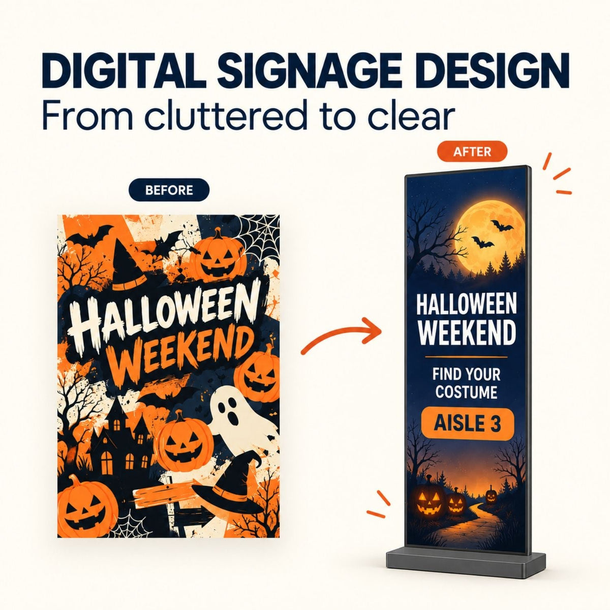
A Halloween promotion can look lively on a designer's laptop and still fail on a screen across the room. Digital signage design works when someone can grasp the message while walking past, know what to do next, and see the right information before the campaign ends. The same design process works after October 31: change the offer and imagery, not the rules that make the screen readable.
Quick answer: Give each screen one job. Put the essential message in the largest type, keep supporting details short, build for the display's actual shape, and test the result from the viewer's real position. For seasonal content, set an owner and an end date before the first slide goes live.
Start with the decision, not the decoration
Before opening a design tool, finish this sentence: “A person standing here should be able to _____.” At a store entrance, the blank might be “find the Halloween offer.” At a café queue, it might be “choose the seasonal drink.” At an event foyer, it might be “find the costume-parade check-in.” Each is a different task, even if the same orange-and-black artwork is available.
Location changes how much information a screen can carry. A passing shopper has less time than someone waiting in line. A directional screen must work the first time someone sees it; the visitor cannot be expected to wait for a later slide to learn where to go.
| Location | One useful screen job | Information to keep visible |
|---|---|---|
| Retail entrance | Make a current offer easy to notice | Offer, end date, where to find it |
| Café queue | Help a customer choose | Item, price, availability |
| Event foyer | Help a guest move to the right place | Activity, time, room or direction |
If you need a broader list of uses before selecting a screen job, see MWEdisplay's digital signage examples. This guide focuses on how to turn one chosen use into legible content.
Six digital signage design choices that improve clarity
1. Write a headline that carries the message alone
Do not make the viewer decode a clever headline to discover the offer. “HALLOWEEN WEEKEND” is atmosphere; “COSTUMES 20% OFF” is information. A useful slide may include both, but the information should win the visual hierarchy. If a person only reads the largest line, they should still understand the point.
2. Separate the headline, detail, and next action
Use a simple hierarchy: the main message first, one short supporting line second, and a location or action last. Avoid putting a price, QR code, dates, disclaimer, logo, and three competing offers at equal weight. If the fine print is essential to a promotion, link to the full terms through an accessible page rather than squeezing unreadable copy onto a moving slide.
3. Design for distance and contrast
Large, plain type on a calm background is easier to scan than thin decorative lettering over a busy photograph. Do not rely on color alone to distinguish a discount from an expiry date. Step away from your laptop and test the actual display from the place where people will see it. Texas A&M's digital signage guidance likewise emphasizes concise copy, readable fonts, contrast, and safe margins.
4. Match the canvas to the physical screen
A portrait floor-standing display needs a portrait layout. A narrow LED display needs even simpler composition and larger text. Do not stretch a 16:9 social post into a tall screen or assume that an image which looks crisp on a phone will look crisp on every display. Check the playback file's aspect ratio and pixel dimensions against the target hardware, and leave breathing room around all important text.
5. Use motion only when it helps
A short transition can draw attention to a new slide. Flashing elements, rapid animation, and constant movement can make a price or direction harder to read. Hold each slide long enough for someone to finish the message; test with a person who has not seen the design before. Provide captions when video conveys information, and keep critical details available through another channel. James Madison University's accessibility guidance also recommends avoiding rapid flashing and providing alternative access to important information.
6. Give every seasonal message an exit plan
Before launch, record who owns the content, where the source file lives, when the promotion starts, and when it must disappear. A Halloween offer still on screen in November makes the display less trustworthy. If your setup supports scheduled publishing, use a planned switch; if you update by USB, put the changeover in a named person's calendar. Do not assume every display or software configuration has the same scheduling workflow.
A worked example: a Halloween screen that can be read at a glance
Imagine a shop running a costume promotion through October 31. A crowded poster might combine pumpkins, four product photos, “spooktacular savings,” a long conditions paragraph, a QR code, and three different percentage badges. That may work as a web page, where visitors can stop and scroll. It is a poor fit for a screen seen in passing.
| On-screen element | Cluttered version | Clearer version |
|---|---|---|
| Headline | “Our Spooktacular Halloween Extravaganza Is Here!” | “COSTUMES 20% OFF” |
| Supporting line | Several offers, dates, and exclusions in small text | “Through Oct 31” |
| Next step | QR code, arrows, and unrelated buttons | “Find them in Aisle 3” |
| Visual | Full-screen spooky collage behind every word | One product image beside a solid text panel |
Example slide:
HALLOWEEN WEEKEND
COSTUMES 20% OFF
Through Oct 31 · Aisle 3
This is a design example, not an advertised MWEdisplay offer or a claim about a real store's promotion.
Check the offer against the shelf label and checkout system before publishing. If stock runs out, replace the creative rather than leaving an attractive but false message on screen. For restaurants and cafés, the same structure becomes an item name, a real price, and an availability window; the restaurant digital signage guide covers menu operations in more detail.
Do not use the same artwork on every MWE screen
The hardware determines what can be read comfortably. MWE's floor-standing LCD digital signage comes in several sizes from 32 to 65 inches, with black and white options shown on the product page. It supports USB playback, HDMI input, and optional CMS-based publishing. A portrait LCD near a store entrance can carry the main offer, a short date, and a direction. Touch is not necessary for a passive promotion.
The MWE 80-inch P1.86 spliceable LED display is a different canvas: a tall, narrow screen with a listed resolution of 344 × 1032. Give it bold artwork and very short copy such as “COSTUMES 20% OFF” plus “AISLE 3.” Do not shrink a detailed menu or a long set of terms onto it. If multiple LED units are combined, prepare content for that confirmed configuration rather than assuming a single unit is a wide video wall.
| Display | Better content fit | Design mistake to avoid |
|---|---|---|
| Floor-standing LCD | Offer plus one or two useful details at an entrance or decision point | Trying to fit a whole flyer on one slide |
| Single narrow LED unit | Large, high-impact headline and one directional cue | Putting small type or dense pricing tables on a 344 × 1032 canvas |
For a smaller space or lower-complexity first screen, start with one well-placed LCD and a single message. Consider LED when the venue and content genuinely call for a larger visual presence. Screen choice should follow viewing distance and job, not a wish to reuse the same creative file.
Reuse the layout after Halloween
A good seasonal template is not covered in permanent pumpkins. Keep a stable structure—headline area, one visual area, supporting detail, and next action—then swap the content. The Halloween example can become a November gift guide, a winter event notice, or a spring launch without rebuilding the hierarchy each time.
| Seasonal version | Headline | Supporting detail | Next action |
|---|---|---|---|
| Halloween | “COSTUMES 20% OFF” | “Through Oct 31” | “Aisle 3” |
| November | “FALL GIFT PICKS” | “New arrivals in store” | “Explore the front table” |
| Winter event | “COMMUNITY MARKET” | “Saturday, 11 AM” | “Check in at Hall B” |
These are sample messages, not a ready-to-run campaign calendar. Confirm actual dates, terms, inventory, and location for each venue. When the campaign changes, keep a neutral evergreen slide ready in case approval or creative delivery is late.
A one-screen publishing checklist
- Choose one location and one job. Stand where the audience will stand and note glare, traffic flow, and viewing distance.
- Write the essential sentence. If it cannot be understood without smaller text, simplify it.
- Create the right canvas. Use the actual display orientation and verify the file on the device, not only in a browser preview.
- Check the facts. Confirm offer terms, price, date, location, and stock with the people running the campaign.
- Test accessibility. Check contrast, text size, slide duration, and whether critical information exists elsewhere.
- Publish and inspect. Walk past the live screen. Look for cropping, glare, unexpected transitions, or unreadable details.
- Schedule removal. Assign a person and a date for replacing the seasonal creative.
A single-screen trial is enough to learn whether the message is clear. Add more displays only after the first screen has a reliable content owner and update routine. For hardware placement and power planning, use the digital signage installation guide.
Digital signage design FAQs
What makes digital signage design different from a printed poster?
Most viewers see a screen while moving and may encounter only one slide. Prioritize a short, immediately understandable message, test it at viewing distance, and provide another place for detailed information.
How much text should go on one digital sign?
Enough to complete its one job, and no more. There is no universal word count for every location. A passing-by offer may need only a headline, date, and direction; a waiting-area screen can carry somewhat more. Test with a fresh viewer before publishing.
Should every seasonal slide use animation?
No. Motion can help signal a change, but static slides are often clearer for prices, directions, and schedules. Avoid flashing effects and give people enough time to read each slide.
Can I use the same Halloween artwork on an LCD and an LED display?
Reuse the campaign idea, not necessarily the file. The MWE floor-standing LCD and the 80-inch LED unit have different canvas shapes and content strengths. Rebuild the composition and test on each actual screen.
Do I need a touchscreen for a Halloween promotion?
Usually not for a passive offer or wayfinding message. Choose touch only when a visitor needs to make a selection or interact with supported software, and confirm that workflow separately.
What happens to seasonal content after the offer ends?
Remove or replace it promptly. Schedule the switch if your configured system supports it, or assign a manual update. Keep an evergreen fallback ready so the screen does not go blank or show expired terms.
Design the message first, then choose the display
The Halloween example is only a starting point. A readable headline, a truthful detail, and a clear next action make the layout useful in November and beyond. If you are planning a new indoor screen, compare MWE's floor-standing LCD options with the narrow 80-inch LED display against your actual location and content. The right screen is the one that makes the intended message easy to see and maintain.

コメントを書く
このサイトはhCaptchaによって保護されており、hCaptchaプライバシーポリシーおよび利用規約が適用されます。